Portfolio · Alignment & Coordination
360 patient record: reconciling the professions of care
The in-between space of an IT infrastructure that cannot be changed and the urgency of care.
- Role
- Senior UX Consultant, who became Head of Design by winning this contract (Pictime)
- Client
- Centre Oscar Lambret, the cancer centre in Lille
- Deliverables
- Tested and validated prototype, technical recommendations, study of internal communications, user circles, service blueprint
- Period
- 2020-2021, 11 weeks, interrupted by lockdown
- Context
- Overhauling an ageing patient record without changing the IT infrastructure; a 4-person squad
The intent
Pictime, the IT services firm I worked for, wanted to go further with its hospital clients than secure hosting. The Oscar Lambret centre wanted to overhaul its ageing patient record without changing its IT infrastructure. The need was shared by everyone involved in care: oncologists, surgeons, anaesthetists, radiation oncologists, medical secretaries.
On the ground, I saw sick children, waiting, and the passion of care staff who could no longer bear the administrative load. The patient record was a silo: the professions struggled to coordinate through scattered communications. The solution could not come from code, but from understanding how information flows between professions.
The project stopped with the first lockdown and resumed when it ended. In the meantime, the need to communicate with the medical secretaries had become something to check, no longer a given.
The mechanics
The challenges
- Buy-in: persuade the medical staff to take part, despite a saturated workload.
- Coordination: ensure good communication between professions with very different needs.
- Feasibility: propose a simple product that brings all the information together without changing the technical base.
The plan
- A usability audit of the existing system.
- Two “open door” days to run the interviews, and two ambassadors per profession to promote the workshops and surveys.
- User circles: mapping who owes what to whom (information, instructions, memos) to model the communication flows.
- A study of internal communications: comparing e-mails, messages sent through the existing tool and chat.
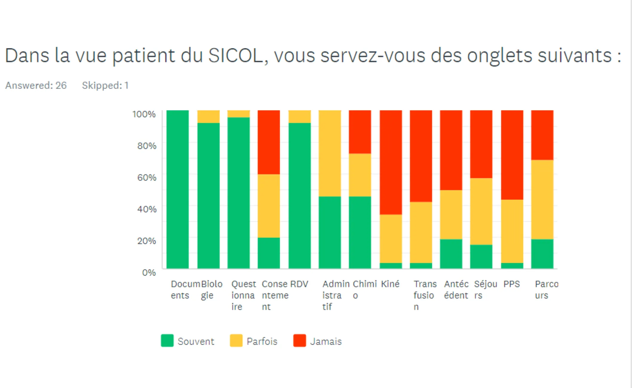
- A survey, then prototype tests in focus groups.
One detail was enough to show the need for usability work: three surgeons were colour-blind, and the record’s alerts were nothing but coloured flags, with no text.
Evidence and deliverables
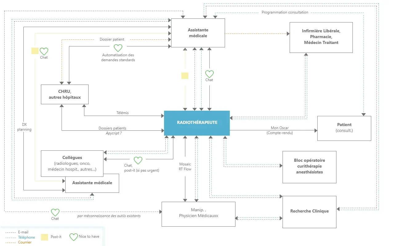
- User circles: the radiation oncologist’s ecosystem, from the university hospital to the operating theatre by way of clinical research.
- The service blueprint, accelerated by the work on user circles and the debrief of the qualitative and quantitative research.
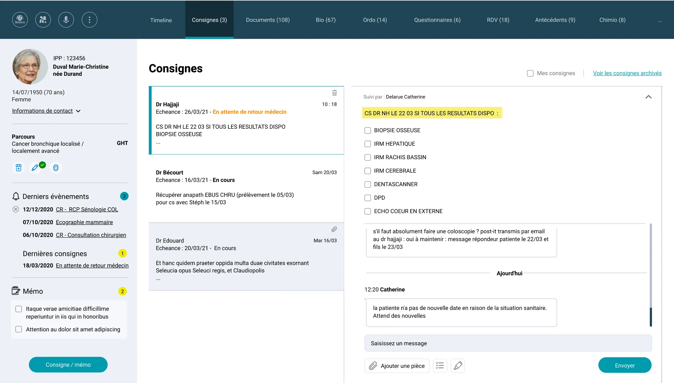
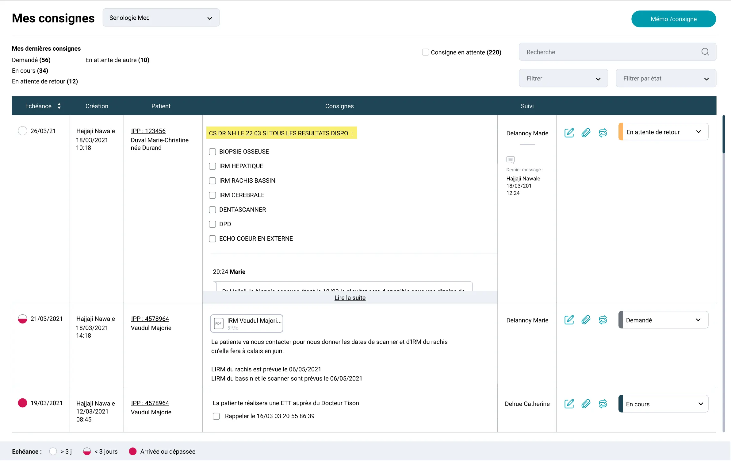
- The “360 patient view” prototype: notified instructions and a clarified medical discussion thread. It came with IT architecture recommendations and a design system. These prototypes had been finalised in a design studio with the different care providers.
The impact
The prototype was tested and validated, along with the technical recommendations. What came next was up to the hospital’s IT team; I left the job shortly afterwards.
For Pictime, this project opened up the healthcare sector beyond hosting, and came before building two websites for mutual insurers.