Portfolio · Discovery & Delivery
Usage-based insurance: from research to MVP
The in-between space of real-time tracking technology and the reassurance users demand about their data.
- Role
- UX Designer
- Client
- Datafolio (startup)
- Deliverables
- Qualitative and quantitative attitudinal studies, UX research process, design system with translation built into Figma (Phrase), finished MVP
- Period
- 2021
- Context
- Adaptive, pay-per-kilometre car insurance; studies carried out in Italy

The intent
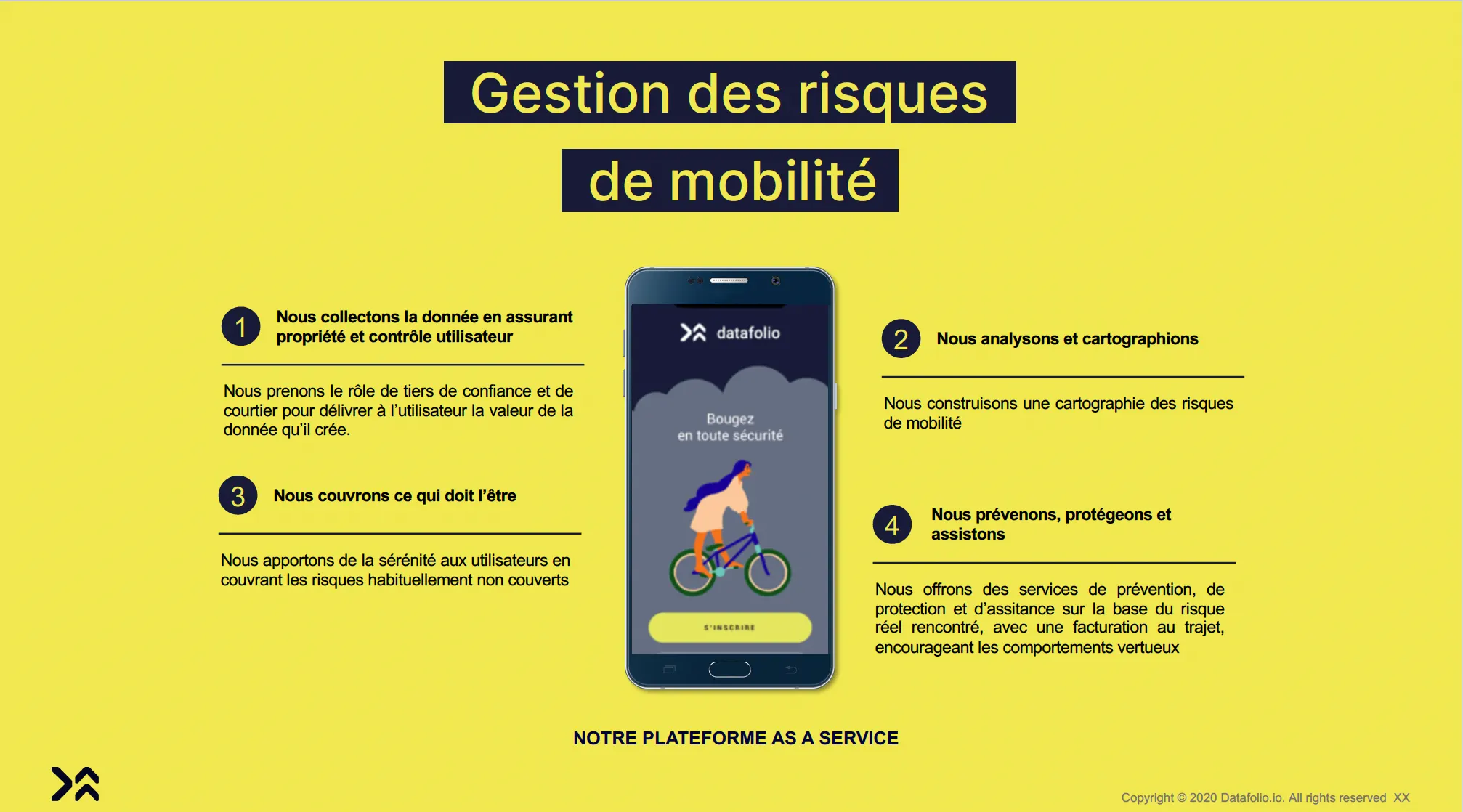
Datafolio was offering a new product: car insurance matched to actual use, by the kilometre. The risks and opportunities of this product had to be established with its target population.
The tension lay in a contradiction. The product’s value rests on journey data that users are reluctant to give. We needed to know whether interest in a risk analysis could outweigh distrust of insurers and the worry of sharing real-time data.
The mechanics
The challenges
- Objectivity: bring internal biases to light and prioritise the hypotheses to check with users.
- Scaling up: finish a robust design system, with translation handled directly in Figma through Phrase, for a multilingual product.
- Proving it fast: move quickly to testing to validate the concept.
The plan
- Launch the UX research process: a schedule and protocols, with a survey of 50 people and interviews with 20 people, carried out in Italy.
- Finish the design system in Figma, with Phrase for translation.
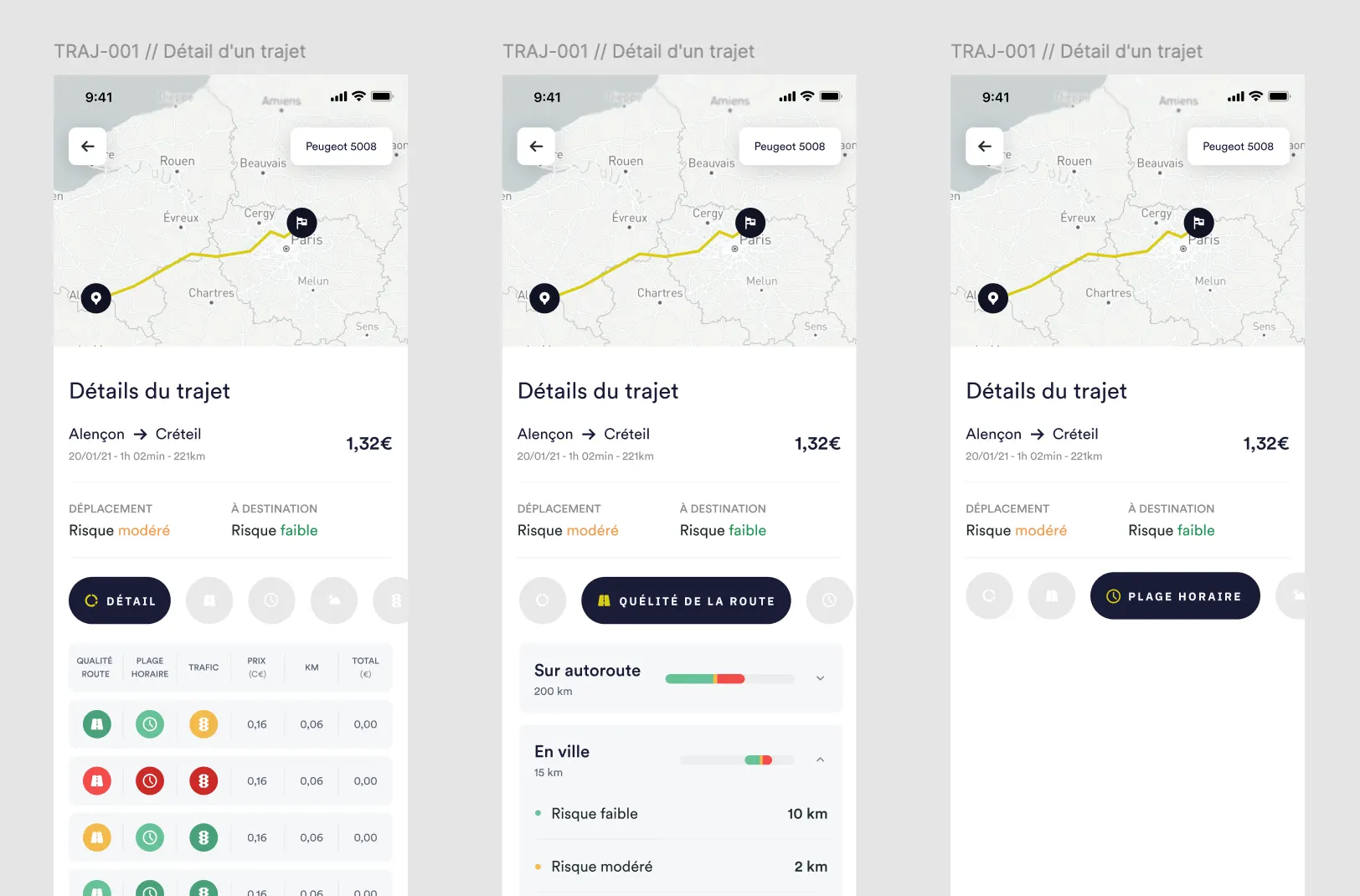
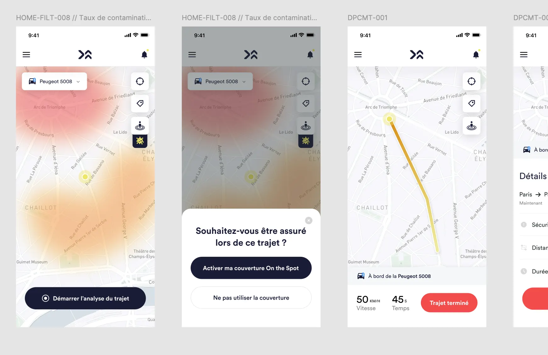
- A first prototype, focused on drivers under 51, to test journey planning and route calculation that takes risk into account.
The survey showed both sides of the issue: 84% of respondents refused to be geolocated all the time, but 91% of drivers wanted to be covered when they rent a vehicle.

Evidence and deliverables
- The survey results, which set out the tension between the need for cover and the refusal of geolocation.
- User verbatims: distrust of insurers, a preference for a monthly subscription.
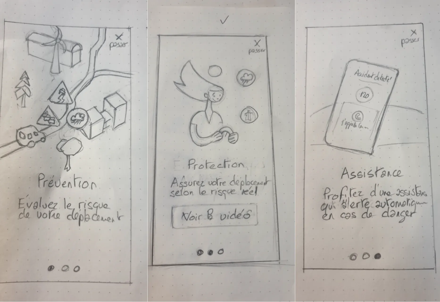
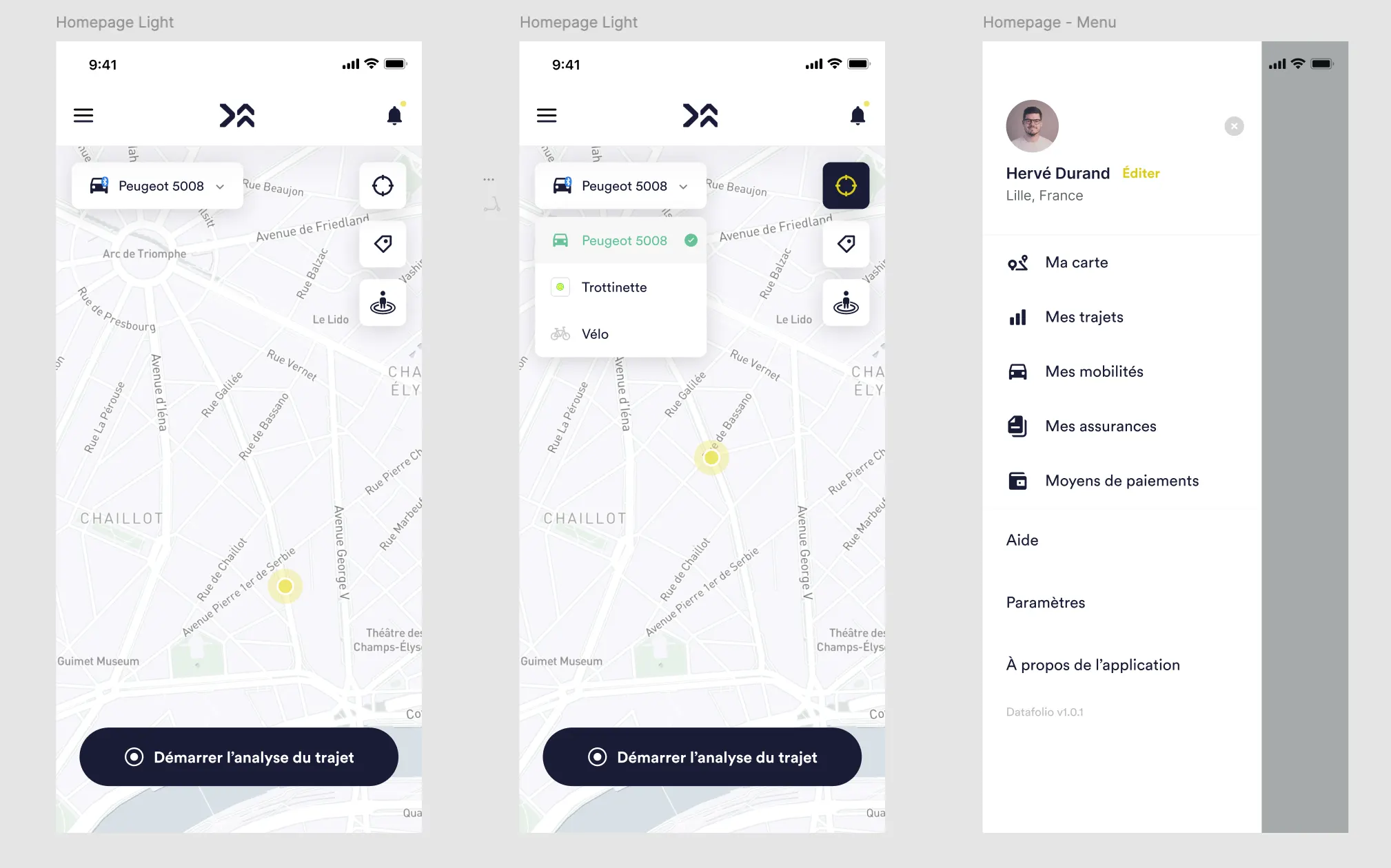
- The first prototype: the difficulties found (price, battery, geolocation) and the answers proposed (monthly risk reports, modular insurance).
The impact
The major change was finding a mobile sensor solution.
The MVP was finished on the basis of these studies rather than on intuition, with a design system ready for a multilingual product.