Portfolio · Discovery & Delivery
Audits & design impact: proof through impact
The in-between space of the aesthetic perception of design and its reality as a measurable business lever.
- Role
- Head of Design (Pictime)
- Client
- Pimkie, Nocibé, Oscar Lambret, FM Logistique, IDS, La Voix du Nord
- Deliverables
- Usability audits with recommendations, best-practice pages, explanatory booklet
- Period
- 2021, 7-day audits
- Context
- An IT services firm specialised in build, which needed to keep its designers busy during development and bring design into its offer; one product designer and one UI designer per audit
The intent
Pictime, specialised in build, needed to keep its designers busy during development phases, but also to bring design further into its commercial offer. In an IT services firm, design is often seen as a final coat of varnish.
Two questions guided the work: how can an IT services firm win new clients through design? And how do you convince people of the business impact of design in under 10 days?
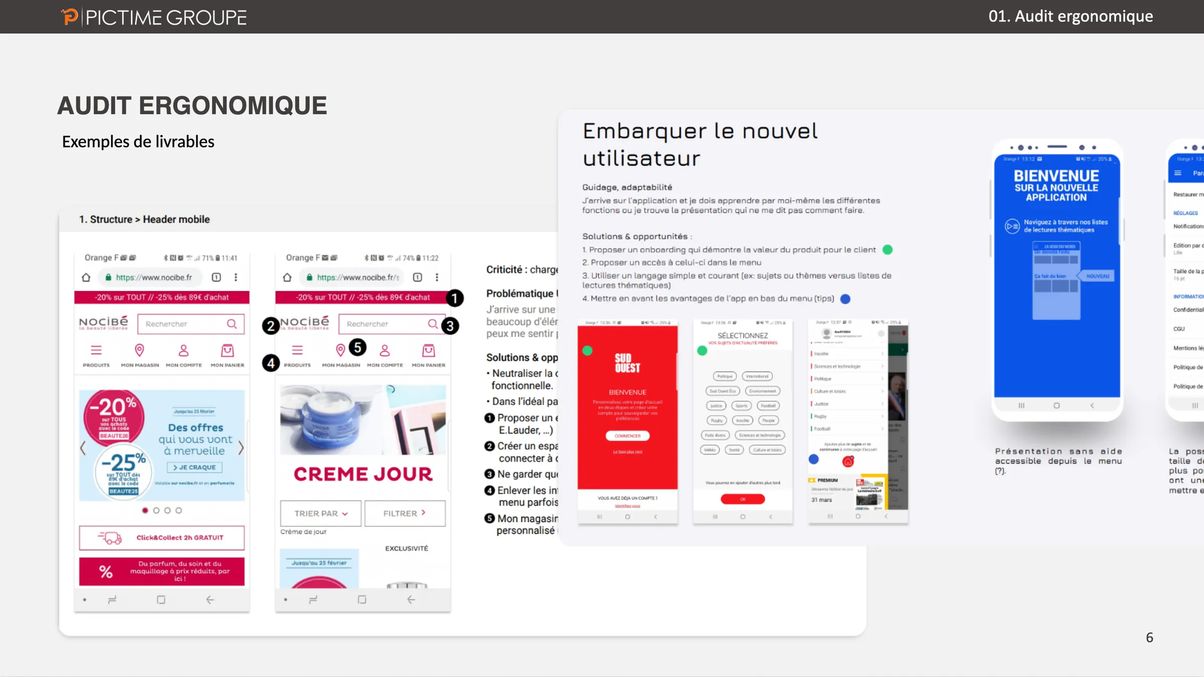
The answer: the usability audit, designed as a documented object, which takes apart the user’s guidance and workload to show where the purchase journey drops off.
The mechanics
The challenges
- Speed: convince people of the business impact of design in under 10 days of work.
- Clarity: a deliverable that is simple to read and understood by every department.
- Synergy: smooth communication between designers, UI designers, developers and sales.
The plan
- An audit in 7 days, run by a tight team: one product designer and one UI designer.
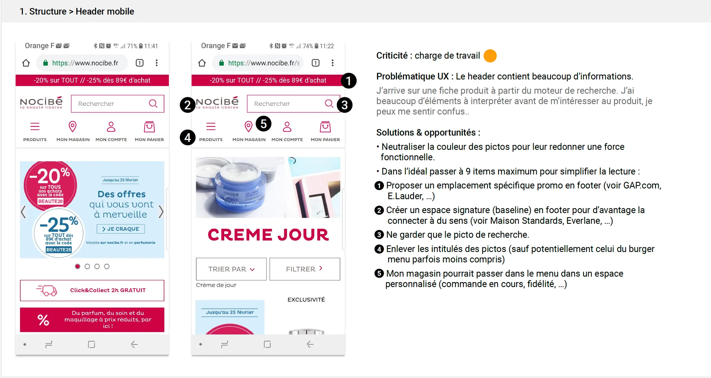
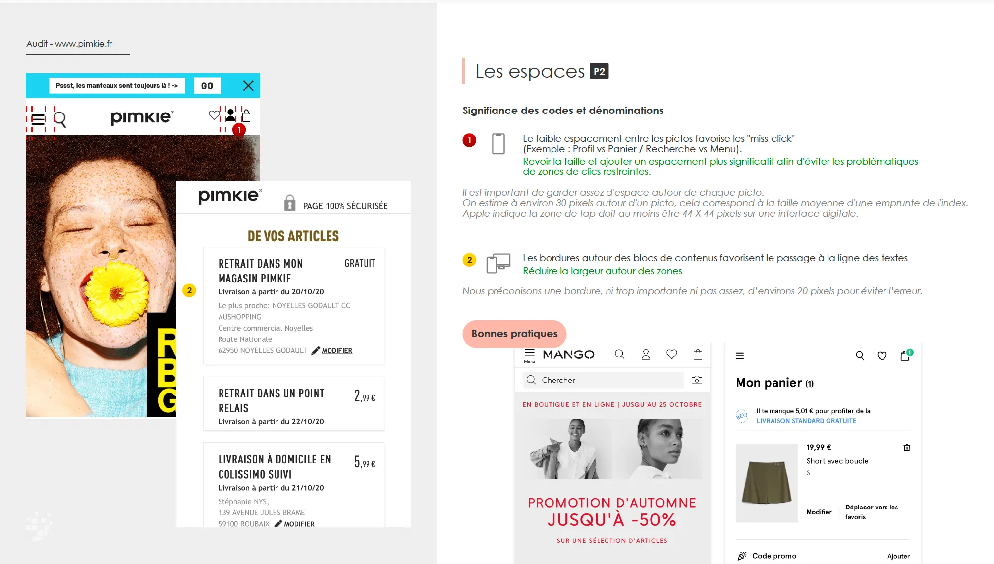
- An analysis grid per screen (guidance, workload), each finding followed by a recommendation.
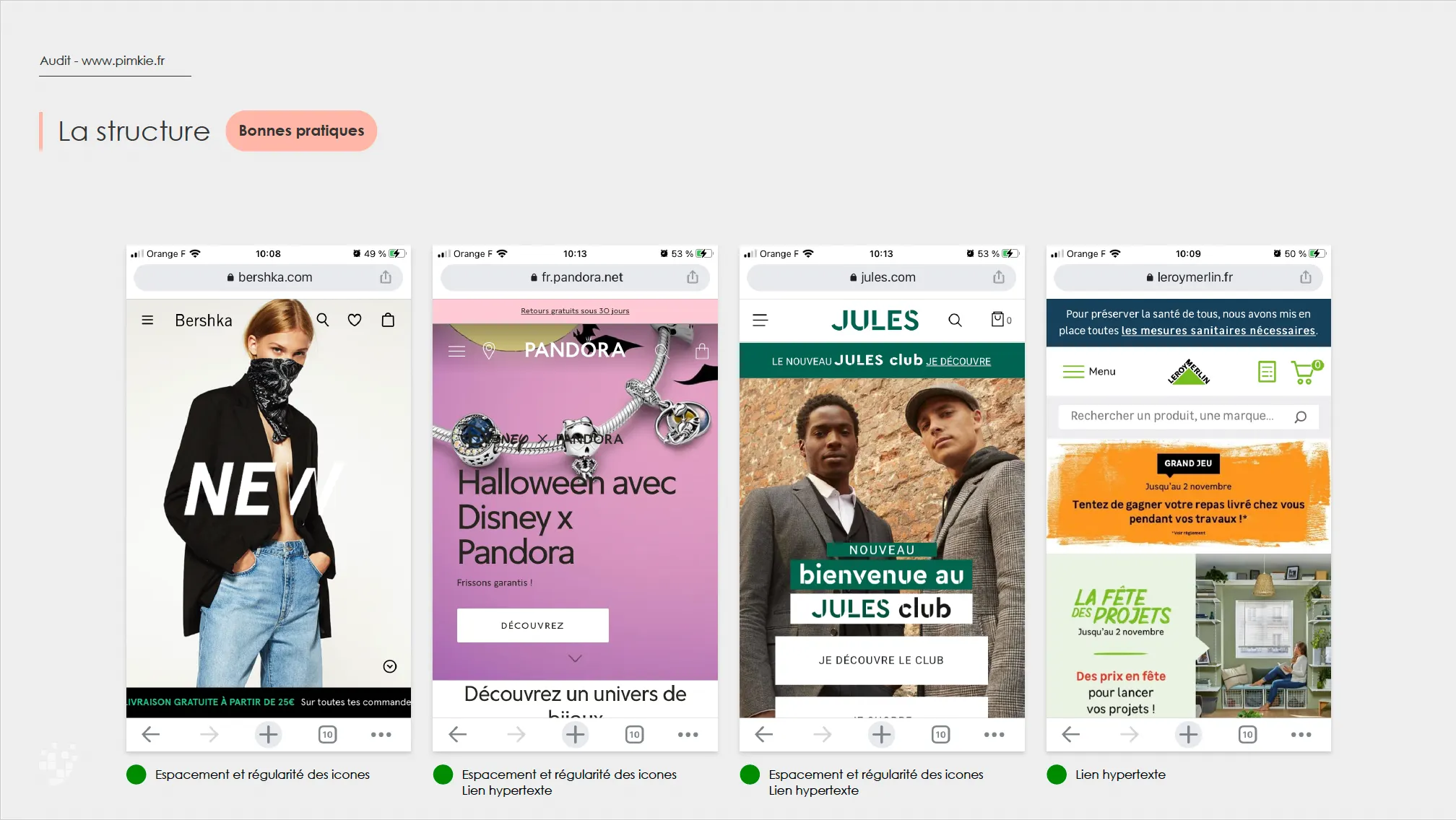
- Best-practice pages, to show what reference sites do on the same journey.
- A debrief grounded in the observations, to justify each recommendation.
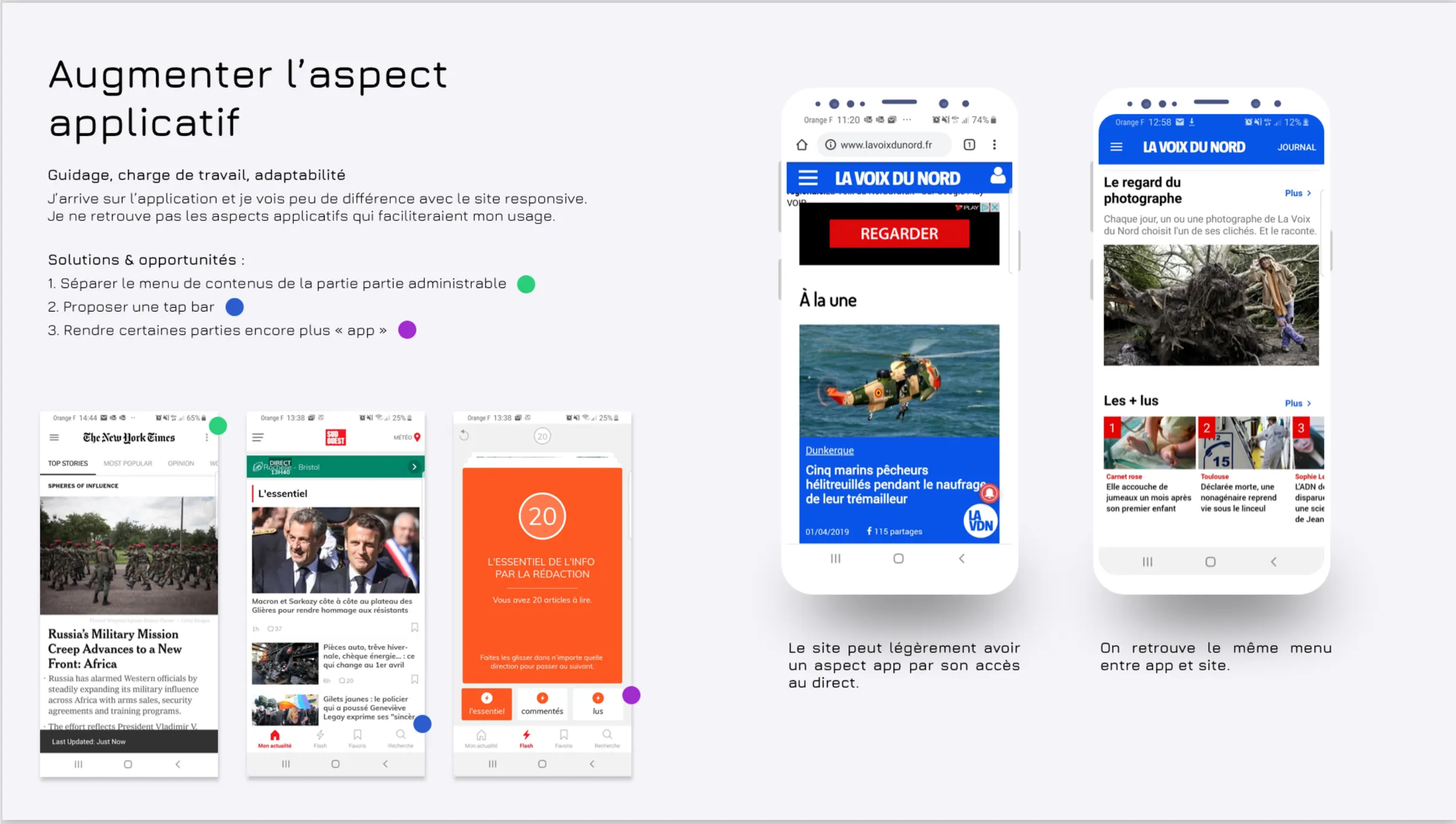
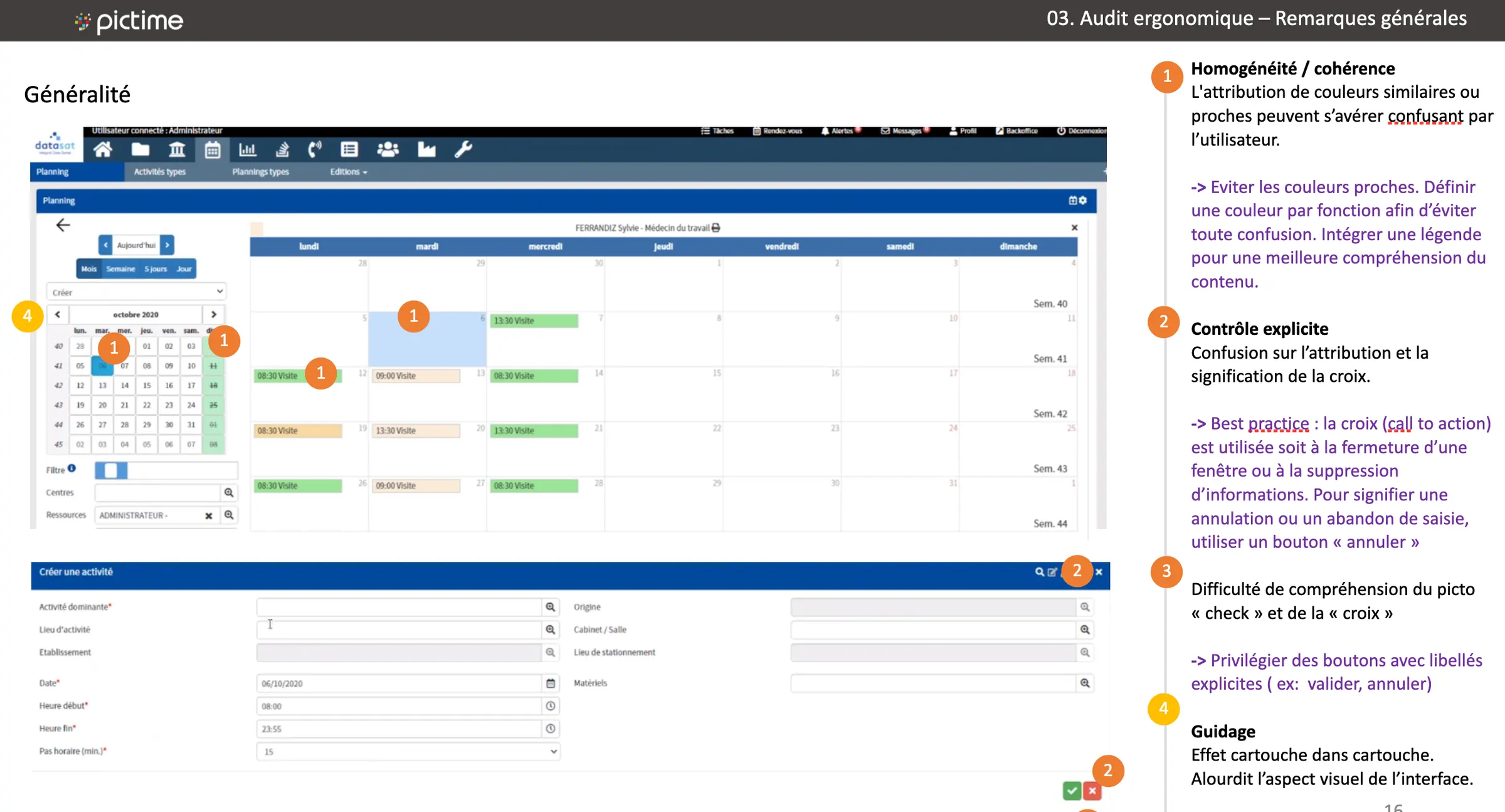
At FM Logistique, it was obvious: during the audit presentation, there was always someone to say “See? What did I tell you!”
Evidence and deliverables
- The Pimkie audit: the analysis of quick ordering and delivery.
- Best-practice pages, for each step of the journey.
- The explanatory booklet, which explains the audit criteria to clients.
The impact
- 1 free audit (La Voix du Nord) and 5 audits sold: Pimkie, Nocibé, Oscar Lambret, FM Logistique and IDS.
- Pimkie redesign: +4% add-to-basket and −22% basket abandonment.
- 4 UI redesigns delivered by the design team: we sold the audit, and won the redesign and the creation of the design system.
- Opening up the healthcare sector and selling complementary offers.